Recently I wrote a post about limits and limitations.
The world we live in tells us that we don’t enough. We need more, better, newer. If there’s a problem, all we need to do is buy a thing and that will make it go away.
There are so many difficulties with this idea! Not least that more stuff usually causes more problems than it solves, and knowing exactly what is enough is vague, so we don’t always know when to stop. Especially when not having enough stuff wasn’t the issue in the first place.
Limits can be a good thing. It makes choices easier, we’re less likely to feel overwhelmed, and the feeling that we are creative and resourceful enough to overcome challenges that limits might present can feel empowering.
One situation where limits can be a really positive thing is painting.
Painting with colours straight out of a painting set can result in the painting looking off. They lack cohesion, which is to say that they don’t really belong together. Light plays a huge part in how things look. That’s how our eyes work after all! Seeing a landscape in winter for example, the light will be quite cold, not too bright, and the colours will be probably earthy and muted, with perhaps some bright if there are berries of lichen.
Mixing colours together means that the new colours have qualities of the colours you have used.
It’s hard to explain! But the colours in a painting will look better if you pick a few main ones, then make the others by mixing them together.

Mixing Greens
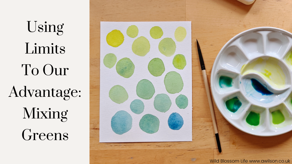
Finding myself in the mood to splash paint about, I thought I’d try seeing what variety of greens I could get from the blues and yellows in my watercolour set.
Mixing greens from blue and yellow can have quite different results depending on which colours you use, and how much of each colour.
It’s an odd kind of advantage that the greens in my set are horrible! There is no way I would use them as they are, so if I need green, I make it myself anyway. So I thought I’d try different combinations of blue and yellow in mixing greens and see what happened.
Lemon Yellow and Prussian Blue

I think there was a little bit of blue already in the lemon yellow. I’m inclined to blame my youngest boy, but in all honesty it probably wasn’t him!
I liked the results. The greens were quite bright, especially the yellowy ones, and the bluey greens are lovely.
Cadmium Yellow and Ultramarine Blue

These greens I didn’t like as much. They were dingy looking, which was surprising as the yellow and blue were both bright. It’s useful to know though. I might need a dingy green at some point!
Gamboge and Cobalt

Not quite as zingy as the lemon yellow and Prussian blue greens, but still nice. The greens feel a little bit richer, and the bluey greens are quite different.
Gamboge and Prussian Blue

At this point I had tried out all the yellows. There was one more blue that I didn’t fancy using, so I decided to try out a couple of different combinations of the yellows and blues I had already used.
Gamboge and Prussian blue produced greens very similar to the lemon yellow and Prussian blue, but a bit brighter.
Lemon Yellow and Cobalt

This combination also made lovely greens. The lemon yellow makes a difference, if you compare it with the gamboge and cobalt greens. The lighter ones are lovely spring greens, and the bluey ones are gorgeous too.
It’s hard to decide which ones I like the best!
Prussian blue is a very useful colour anyway. I often use it for shadows and to make colours darker. The greens with Prussian blue and lemon yellow, and Prussian blue and gamboge are lovely. The lemon yellow and cobalt greens are most noticeably different in the bluey greens.
I had fun and it was useful to see what different greens I could make. They’re much nicer than the greens in the watercolour set!
If You’re Not a Painter…
Maybe you don’t consider yourself a painter. But colour is still a factor in knitting, crochet, embroidery and sewing. Even if you follow a pattern, you’ll still need to decide on which colours to use. And picking colours that go together can be quite hard.
My little painting experiment in mixing greens means now that if I need to choose 2 shades of green for a project, I’ve made things much easier for myself. 2 greens from one of those colour combinations would probably work. Even 2 from colour combinations that have either a yellow or a blue in common would also probably be fine.
So I could decide on the colours, then take them along to the yarn or fabric shop, or match them to the embroidery thread colour chart, and have nice colours that go together for my project!
It doesn’t have to stop at green. If I wanted to use a Prussian blue/ lemon yellow green with purple, I could make purples with Prussian blue. Or if I wanted to use orange, I could make oranges with lemon yellow, and choose the colours from there.
You don’t have to be able to paint neat little watercolours of cottages, or landscapes, or cows, or pebbly beaches to mix colours together. It’s an experiment to see what works well and what you like. You can’t go wrong!


Leave a Reply