
Whatever kind of approach you take to making things, whether you like to follow a pattern or if you prefer to do your own thing, you will probably need to make a decision about which colours to use.
It sounds easy! Just pick some colours you like and use those! Except it isn’t that easy. There’s more to it than just choosing your favourite colours and hoping for the best. It’s very easy to pick colours that don’t go. What is most difficult is when they almost go, because it can be harder then to identify exactly why they don’t.
I’ve been there myself. It’s why in the past I’ve bought yarn packs and fabric bundles, because somebody else has already done the difficult job of choosing colours that go. All I’ve had to do is choose a particular colourway.
It’s also why I created my free mini course, Crafted Colours (you can find out more about it here). Choosing colours from a photo makes it more likely that the colour scheme will work. Having some idea of colour theory helps, even when you are choosing colours from a photo.
What is Colour Theory?
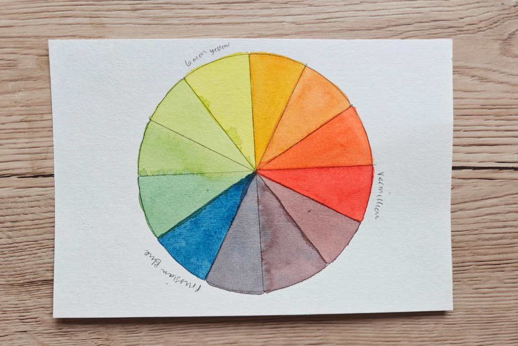
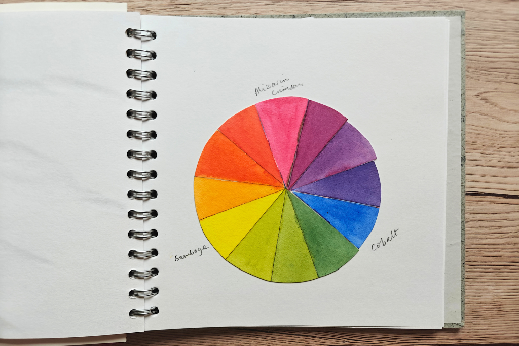
Colour theory starts with the colour wheel. You will probably have seen a colour wheel before. There are different versions, but what they all have in common is that they show primary, secondary, and tertiary colours.
In case you can’t remember, primary colours are red, yellow and blue. These are colours that can’t be made by mixing other colours together.
Secondary colours are made by mixing 2 primary colours together, making orange, green and purple.
Tertiary colours are the colours made by mixing one primary colour and one secondary colour, so red-orange, yellow-orange, yellow-green, blue-green, blue-purple and red-purple.
It’s worth mentioning that the kinds of secondary and tertiary colours you end up with will result in the versions of the primary colours you start with.
So if you fancy making a colour wheel with paint or coloured pencil, you might like to experiment a bit with different shades of red, yellow and blue.
Using the colour wheel as a starting point, there are all kinds of ways to choose colours for a colour scheme, from where they are in the colour wheel, to how colours look next to other colours, to considering moods, emotions and meanings that are associated to various colours and colour schemes.
Warm vs. Cool Colours
One way to choose colours for a colour scheme is to decide whether to use warm colours or cool colours.
Red, orange and yellow invite feelings of warmth and cosiness, and can feel energising.
Green, blue and purple are cooler colours, and suggest feelings of calm.
So when choosing colours for a project, you could consider whether you would like bright, warm and cosy, or whether you would prefer calm and serene.
It’s important to mention that there are warmer versions of cool colours as well as cooler versions of warm colours. For example turquoise would sit with the cool colours, but is actually quite warm.
But considering whether you would prefer vaguely warmer or vaguely cooler is a good place to start.
Complementary and Analogous Colours
Complementary colours are colours that are opposite each other on the colour wheel, like blue and orange, or yellow and purple. They create a bold contrast.
Analogous colours are ones that sit next to each other on the colour wheel, like blue and green, or yellow and orange. Analogous colours tend to be harmonious and soothing.
Choosing several colours that are evenly spaced around the colour wheel will give a colour scheme that is balanced and vibrant.
Using Neutrals and Contrast
Using neutrals and contrast is another way to choose a colour scheme. You could pick one or two vibrant colours you like, then add neutrals. Grey is a good neutral colour, as is taupe. Cream or white can be used, or black.
I find that in nature, green and blue are often the neutral colours. Just think of the sky as backdrop, or the leaves of tree, or a plant with brightly coloured flowers.
Neutrals are good for helping other colours to stand out.
Adding contrast, like light and dark, or soft and bright, gives visual interest. It can also make it a little bit easier to choose colours. For example, you might choose a bright green with a softer darker green, or a light pink with a darker pink. It works with neutrals too, like including a lighter grey and darker grey in a colour scheme with some bolder colours.
A Seasonal Twist
As somebody who often takes inspiration from nature, I love the idea of adding a seasonal twist. In spring, the colours are fresher and in summer, they are often brighter. In the autumn, the colours tend more towards earthiness, and winter colours often reflect the cold weather.
So if you are finding difficult to choose which green to use, see what is around you. What colours are there that you could use as neutrals? If you want to use bolder colours, or contrast, what is there in the landscape?
Experiment and Trust Yourself!
The idea is here that knowing a little bit about colour theory will make it easier for you to choose a colour scheme for a project. Please don’t take any of this as a list of rules that musn’t ever be broken!
Colour theory is a tool. It gives a starting point when you are not sure where to begin.
The best thing to do, if you want to, is to try some of this out and see what you like. In the end, it is not about following a set of rules set by somebody else, but finding combiniations of colours that you like to use.
Here are some ideas of things you could try.
Make colour wheels. I quickly did a couple using watercolour. You could use another form of paint, or coloured pencil.
You might like to make colour wheels using thread, or yarn, or fabric.
You could make colour wheels starting with different primary colours, or for the different seasons.
If you have done my free mini course, Crafted Colours, you could try putting colours from your photos into a colour wheel.
Try different combinations: bold contrasts, or analogous colours. Colour stripes, or squares, Make little patchwork patches, or knit squares, or crochet granny squares.
Try one or two bold colours with a couple of neutrals, through drawing or painting, fabric scraps or crochet.
Try different shades of the same colours: some bolder, some softer. You could use paint, or you could be adventurous with embroidery thread to weave, sew or braid.
I encourage you to treat it like an experiment. It’s a way to gain knowledge about colour and what you like to use.
If you try any of these ideas, I’d love to see! If you are on Instagram, you can tag me anna_wildblossomlife.


Tooting my own horn, I’m happily and LUCKILY the kind of person who can go into a shop and find the exact shade of something to go with something I already own. (Did that make sense?) I think I was born with a kind of color radar that alerts me to colors that are just “not quite right.” There’s a house on our street whose trim jars me every time I see it because it’s just that bit “off” from the color of the main part of the house. the house is kind of a “Spring green,” clean and crisp while the trim is kind of muted with a gray hued “Lemon-lime.” It’s the hue, I think, that does it. Bright vs. Toned down. Anyway, I know that a lot of my friends ask for my help in “seeing” things for them. I don’t mind doing it at all. I love color. Thanks for creating this post to help others “see” the joy of it. Like music, it is something that can be learned with practice. Mother Nature has it down pat!